Stylory
Date
July 14, 2016
Category
Brand IdentityAbout This Project
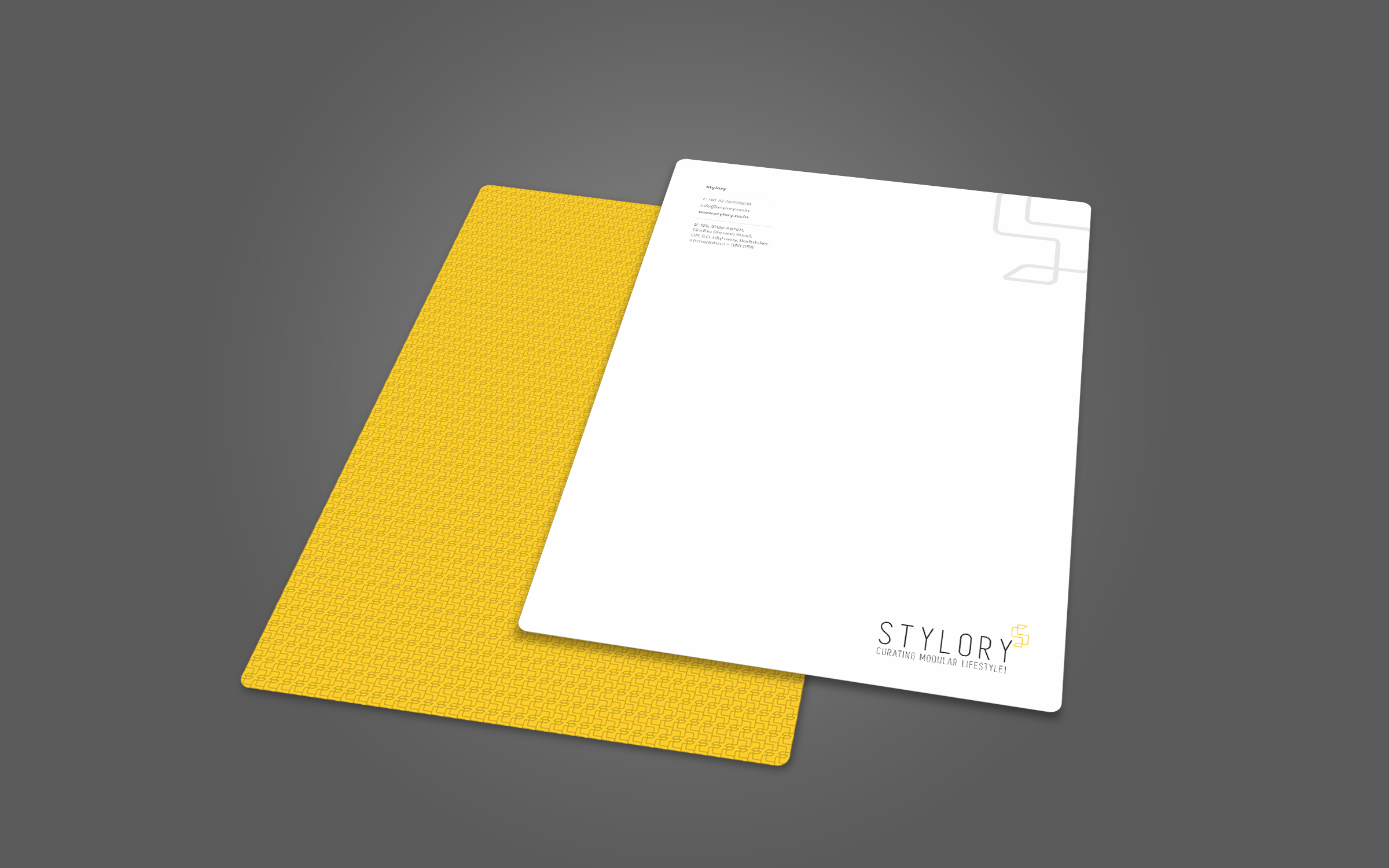
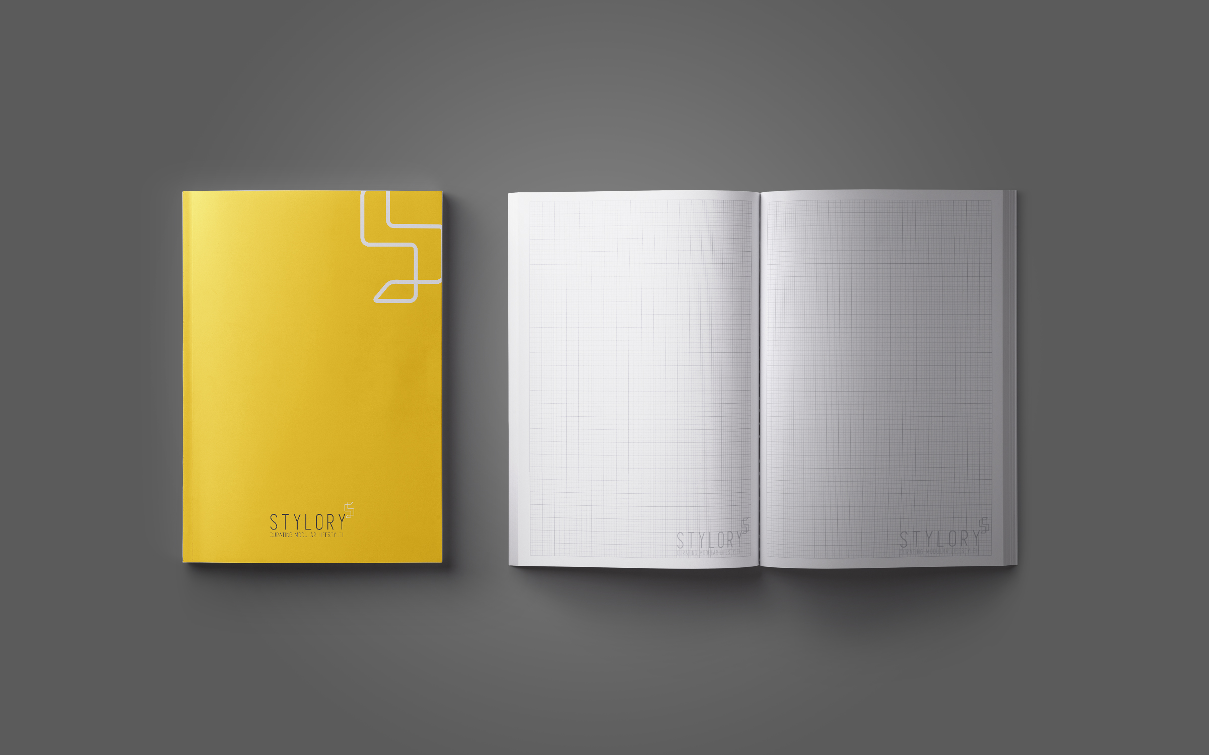
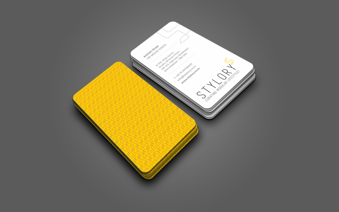
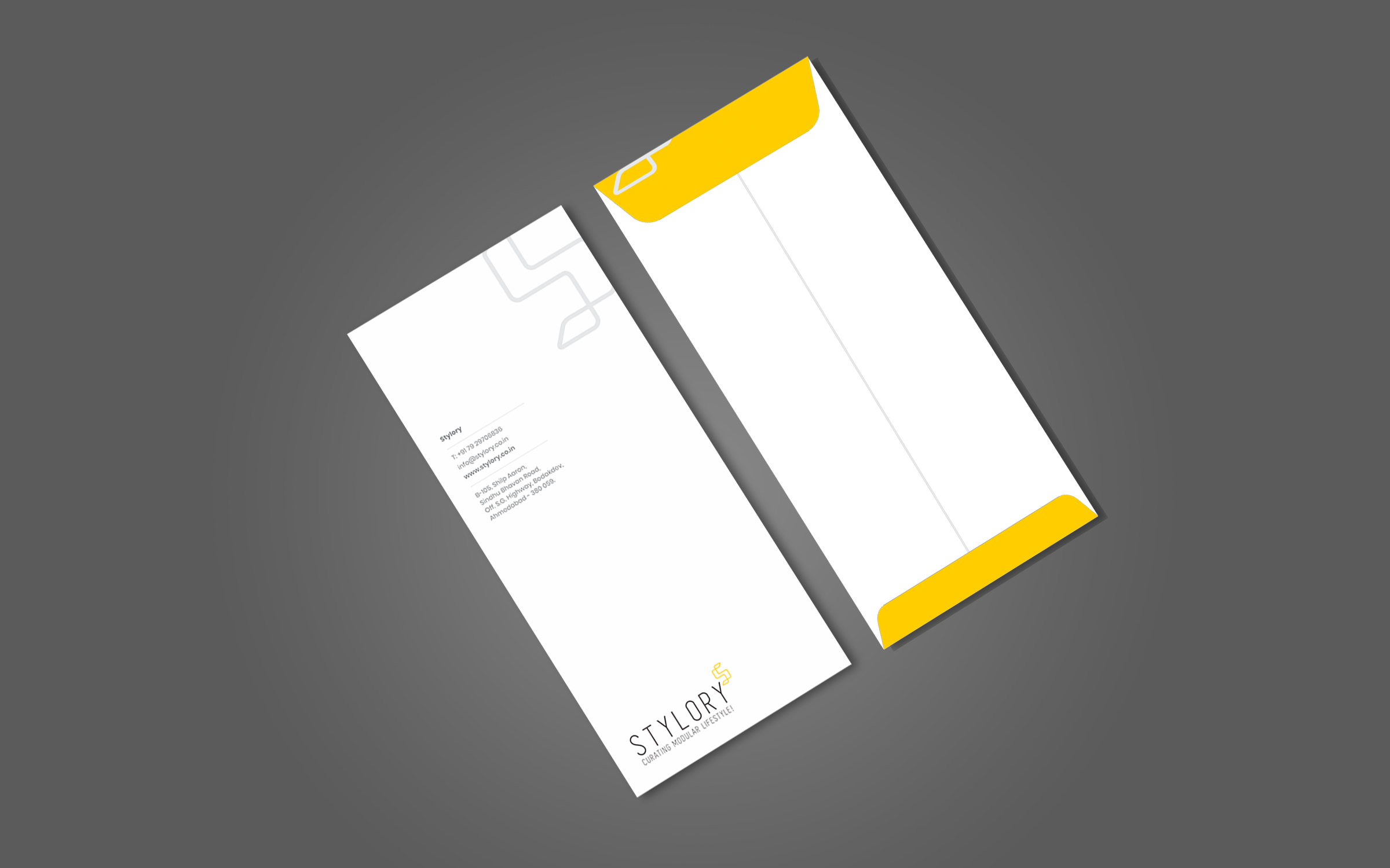
Yellow is the new black!
A team of creative minds can not only redefine the shades, but brands too and Stylory simply attests to this theory. Our client had approached us with his concerns about him not being able to establish his own brand of Modular Furniture (with core expertise in modular kitchens). After much brainstorming in the confinements of our creative hub, what we delivered was Style+Theory that blended spaces and designs in sync with the company’s aesthetics which was amiss earlier. The logo is simply the replica of this thought process. The intersection design of ‘S’ in the logo represents the modernity and the uniqueness of the brand’s designs and also the ideal distribution of the spaces. Furthermore, the brand positioning could not have been apt than ‘Curating Modular Lifestyle’